

The Home Office and Office of National Statistics regularly publish detailed tables showing the numbers of people held in immigration detention and subsequently released or removed from the UK. But what do these figures mean, and how can we use them?
One way is to identify key statistics that give us some idea of how the Home Office is using detention. This can help us to understand to what extent the Home Office is meeting its own aims and expectations. It can also help to identify which direction the detention estate is heading in.
The Detention Forum is primarily interested in figures that tell us about the scale and ‘effectiveness’ of detention. How many people are detained, and for how long? How many people are removed from detention, or released back into the community?
We’ve created a series of charts below which provide a visual representation of some of the Home Office’s statistics, along with tables showing the data they refer to. You are welcome to reproduce these graphs and tables in your own work, or tell us what you would find useful and we can create others. Unless otherwise stated, all figures are taken from the Home Office’s Detention Statistics tables for the years ending December 2017 and March 2018.
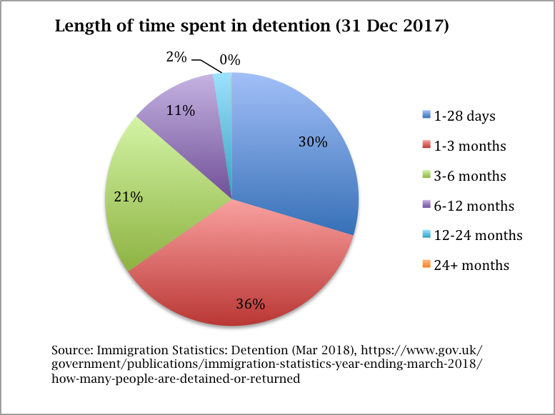
This first pie chart gives a visual breakdown of the length of time people have spent in detention at a certain moment in time (in this case, 31 December 2017). It provides a helpful representation of how effective a 28-day time limit would be in reducing the scale of detention: only the blue piece of pie (30%) would be left.

This chart is based on figures taken from DT_11_Q (people in detention by sex and length of detention). It represents the number of people in detention at 31 December 2017, but we’ve also included the figures for 31 March 2018 in the first table available here for comparison. We’ve added together some of the time periods for ease of visualisation; a more detailed breakdown is available from the Home Office tables. Percentages are rounded up or down to the nearest whole figure. You can download the chart to use in your own work here.
This bar chart shows changes in the size of the detention estate over the past 8 years. The numbers of people detained followed a steady upward trajectory until reaching an all-time high of 32,447 in 2015, the same year that the Report of the Inquiry into the Use of Immigration Detention was published, the Detained Fast Track was suspended, and Stephen Shaw commenced his review of immigration detention. Since then, numbers have fallen, with fewer people entering than leaving detention in 2017 for only the second time since 2011. This offers one way of visualising the Home Office’s progress against Shaw’s recommendation of reducing the size of the detention estate.
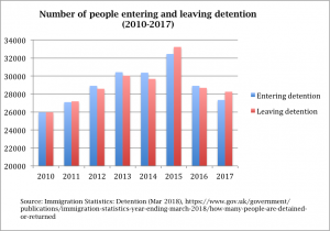
This chart draws on figures taken from DT_01 (people entering detention by age, sex and place of initial detention) and DT_05 (people leaving detention by reason and age). You can find these figures in table two available here, and the chart itself is available to download here.
This line graph shows the general trends in numbers of people being (a) released and (b) removed or deported from detention over the past 8 years. From 2012 onwards, there is a gradual decrease in the numbers of people returned, which mostly corresponds with an increase in the number of people released. If we compare this with the previous bar chart, it demonstrates that an increase in the size of the detention estate does not necessarily correspond to an increase in the numbers of people removed or deported. In fact, it appears that the greater the number of people detained, the less effective the detention system becomes. There is an obvious caveat: after the dramatic spike in numbers of people released in 2015, the overall number of people released drops back again in 2016. However, it never falls below the pre-2015 numbers.
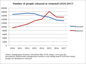
This graph draws on figures taken from DT_05 (people leaving detention by reason and age). To get the ‘released’ figure we have added together all the categories except ‘returned from the UK’ and, as above, we have added together some of the time periods for ease of visualisation. You can find these figures in table three available here, and download the graph here.
This line graph shows that the effectiveness of immigration detention in securing deportation or removal from the UK follows a general downward trajectory. The only period within which someone is more likely to be removed than released is 28 days or less. After this, the effectiveness of detention declines. In general, the longer someone is held in detention, the less likely they are to be removed, calling into question the purpose of detaining someone indefinitely. The obvious caveat is that the likelihood of being removed or deported does increase over certain periods (e.g. 6-12 months), although it never reaches 50% or more again after the initial 28 day period.
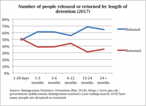
This graph draws on figures taken from DT_06 (people leaving detention by reason, sex and length of detention). As above, to get the ‘released’ figure we have added together all the categories except ‘returned from the UK’, and we have added together some of the time periods for ease of visualisation. Percentages are rounded up or down to the nearest whole figure. You can find these figures in table four available here and download the graph here.